Improving the information architecture of the Smart Pension member app
In this article we explain how we used tree testing to measure and improve the effectiveness of our information architecture

It’s not always easy to find out what users are trying to do when they interact with your product, or where they need more help – this article explains how we used site search analytics to learn about user intent, leading us to design a new feature
17/6/2022
We find that a lot of our best work starts by poking around and digging out insights from places that other people have overlooked. Smart Pension has a help centre website that’s hosted using a tool called Intercom. When we learned that Intercom has search analytics for the help centre, we couldn’t wait to take a closer look!
We looked at what people were searching for in the help centre and found that the query frequency seems to roughly follow Zipf’s law. In fact, the top 10 search queries accounted for around 60% of all search queries in the last year. This pattern is normal for most site search engines, and it’s something you can learn about in Louis Rosenfeld’s book “Search Analytics for Your Site”. These are the top 10 searches made by scheme members (May 2021 - May 2022), below. We realised that if we can just help people with these top 10 searches, we’d help most people, most of the time.
We took a close look at the ‘’end to end’ experience for users when they made these searches and discovered that it must have been very frustrating.
What a series of steps! Two things became clear. Firstly, we needed to improve our information architecture to make the features easier to find (this is now part of a much bigger initiative that we’ll write about another time). Secondly, we needed to bring help inside the app, so people didn’t have to go such a long, roundabout route.
We realised that by bringing help search inside the app, we would be able to link users directly to the right feature, instead of linking them to an article that described how to find the feature. This realisation seems obvious in retrospect, but that’s how most design insights work. Once you frame a problem well, the solution often just presents itself. So we started looking at “universal search” – similar to Apple’s Spotlight or CommandBar – where the user can find features and help articles from a single search box. This kind of search feature has become more and more popular in apps recently.
With these realisations we decided on three main principles for the design of our search tool:
We started our design discovery process by thinking about where we should put the help search box. If you’re an engineer, you’ll probably see this as a superficial starting point - but we didn’t want to focus on the tech stack on day one and risk ending up with an over-engineered product. User needs have to come first, so we started by thinking about the user interface.
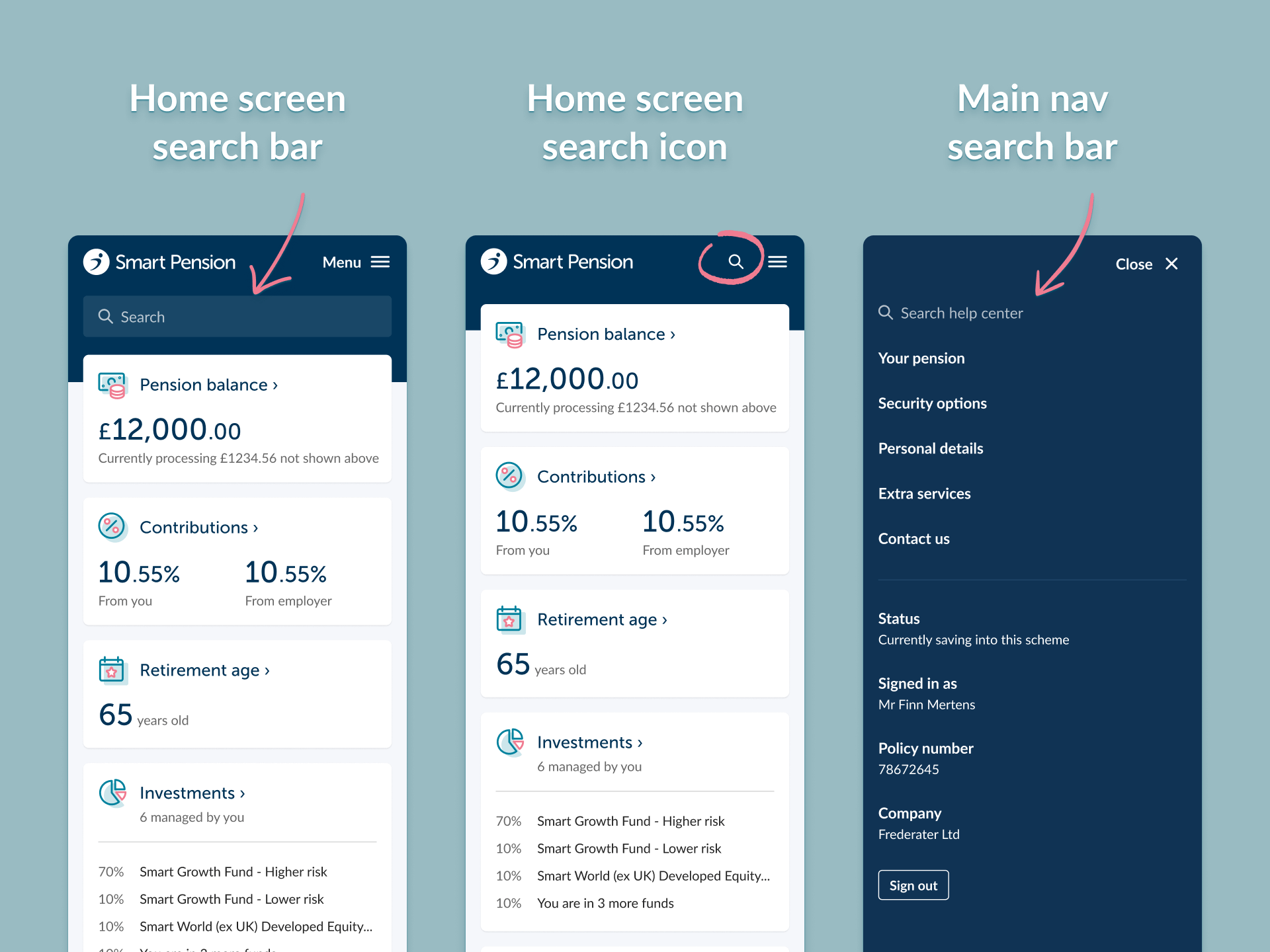
We tried putting the search box at the top of the member app home screen, but that felt too obtrusive. We wanted members to be able to find the search tool when they needed it, but not at the expense of seeing other things first, like their pension balance.
We also tried putting a search icon at the top right of every page, next to the menu. This was just too cluttered though - to fit it in, we’d have to drop the word “Menu” from the “≡” burger icon. Icons without labels are less accessible, so that idea was out.
Other universal search products use a keyboard shortcut (like Command+K) or a swipe gesture, but that approach means that users need to learn something - and then remember it for future use. We know from our analytics data that our users (pension scheme members) don’t tend to sign into their pension accounts very often, so they’re unlikely to memorise these sorts of shortcuts. Our design strategy needs to be closer to gov.uk than Final Cut Pro.
After much consideration and many mockups, we ended up putting the help search feature inside the main navigation, which opens from the right of the screen when the “Menu ≡'' button is tapped. This felt like a good compromise – the purpose of the menu is to let users navigate, and search is a feature that supports navigation, so the two things seem to go together well. This is of course all just conjecture until we put it in front of real users! When we run some user research we’ll see how users respond to the design.
Counting the possible search results, we realised how few there would be. We had just 15 features and 23 help articles in our search space. By any search engine standards, this is tiny. This meant we didn’t need to use a ‘full on’ search engine (like Elasticsearch or Algolia) - we could just load the data into the front end as a JSON file, and have some JavaScript do the work in the browser.
For each item, we recorded the following attributes: search query, result label, result type and URL. In search engine terminology, the list of search queries is sometimes called a “synonym ring”. These are all the different queries you can enter that will deliver the same result. For example, if a user searches for any of the following: “death, beneficiaries, expression of wish, die, pass away, will, inheritance, inherit”, they will see the same two search results: (i) a link to the beneficiaries feature; and (ii) link to a help article about it: “What happens if I pass away before I retire?”.
We recognised that our synonym rings were probably going to be the most helpful part of this new search feature. They connect the kind of queries that users would naturally employ (like “death” or “inheritance”) with the formal pension terminology that we’re often obliged to use for legal and regulatory reasons (like “expression of wish” or “beneficiary”). Many users don’t know what these technical terms mean, so any link we can make to more everyday language is extremely helpful.
You can only get so far designing static mockups, especially for a search feature - what matters most is how it actually behaves when it’s used. We’re big fans of Webflow for prototyping - it’s a low-code website builder that lets us build realistic, responsive prototypes. Conveniently we found a jQuery (JavaScript) plugin called HideSeek that did everything we wanted. We’d never use jQuery on the real platform but it was perfect for quick prototyping.
We were happy with the outcome. The end result looks, feels and functions like the real thing.
Our next step will be qualitative user research, to get insights into whether users find any aspects of the design confusing or difficult to use. Though important, qualitative research won't tell us much about the language that users naturally use when they’re trying to solve real life problems. For that, we need search analytics.
This brings us full circle. Search analytics gave us the opportunity to design this new, improved help search feature. Once it goes live, we’ll have a new stream of search analytics data that will help us understand user intent and improve our product to meet their needs.
Written by Joe Russell
Edited by Harry Brignull
With thanks to the Smart Innovation Team
Design and tech
Smart is a global savings and investments technology platform provider. Its mission is to transform retirement, savings and financial wellbeing, across all generations, around the world.
Smart launched in 2015, its technology platform – Keystone – serves the needs of retirement savers globally. Keystone is specifically designed to help governments and financial institutions (including insurers, asset managers, banks and financial advisers) deliver retirement savings and income solutions that are digital, bespoke and cost-efficient. In addition to the UK, Smart is operating in the US, Europe, Middle East and Asia, with more than a million savers entrusting over £15 billion in assets on its Keystone platform.
Aquiline, Barclays, Chrysalis Investments, DWS Group, Fidelity International Strategic Ventures, J.P. Morgan, Legal & General, MUFG and Natixis Investment Managers are all investors in Smart.
Email: pressoffice@smart.co